


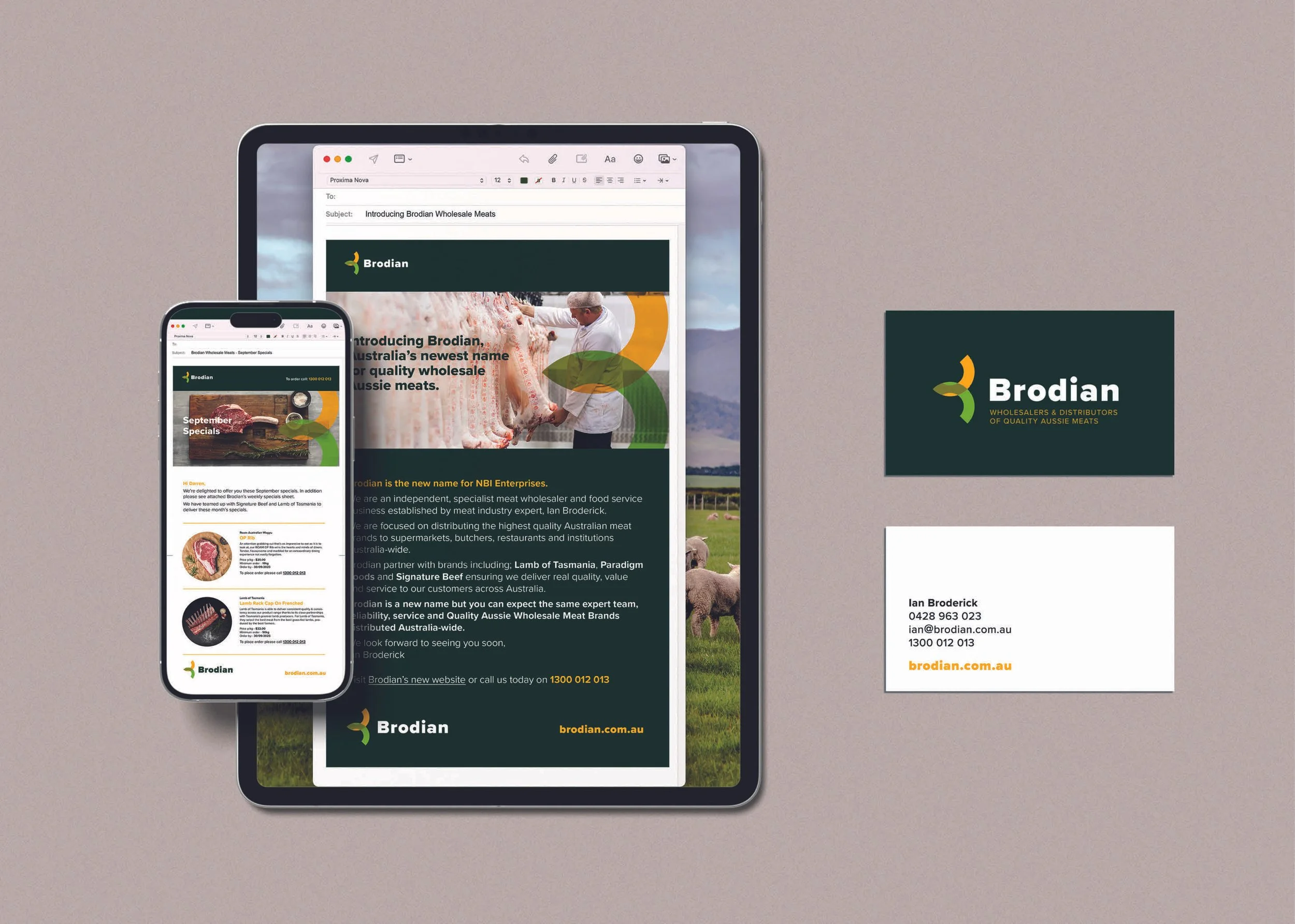


Brodian is an independent, specialist meat wholesaler and food service business. We are focused on delivering the highest quality Australian meat brands to supermarkets, butchers, restaurants and institutions Australia-wide.
Dovetail worked closely with Brodian to develop a clear brand strategy and authentic positioning to align the brand to the business ambitions.
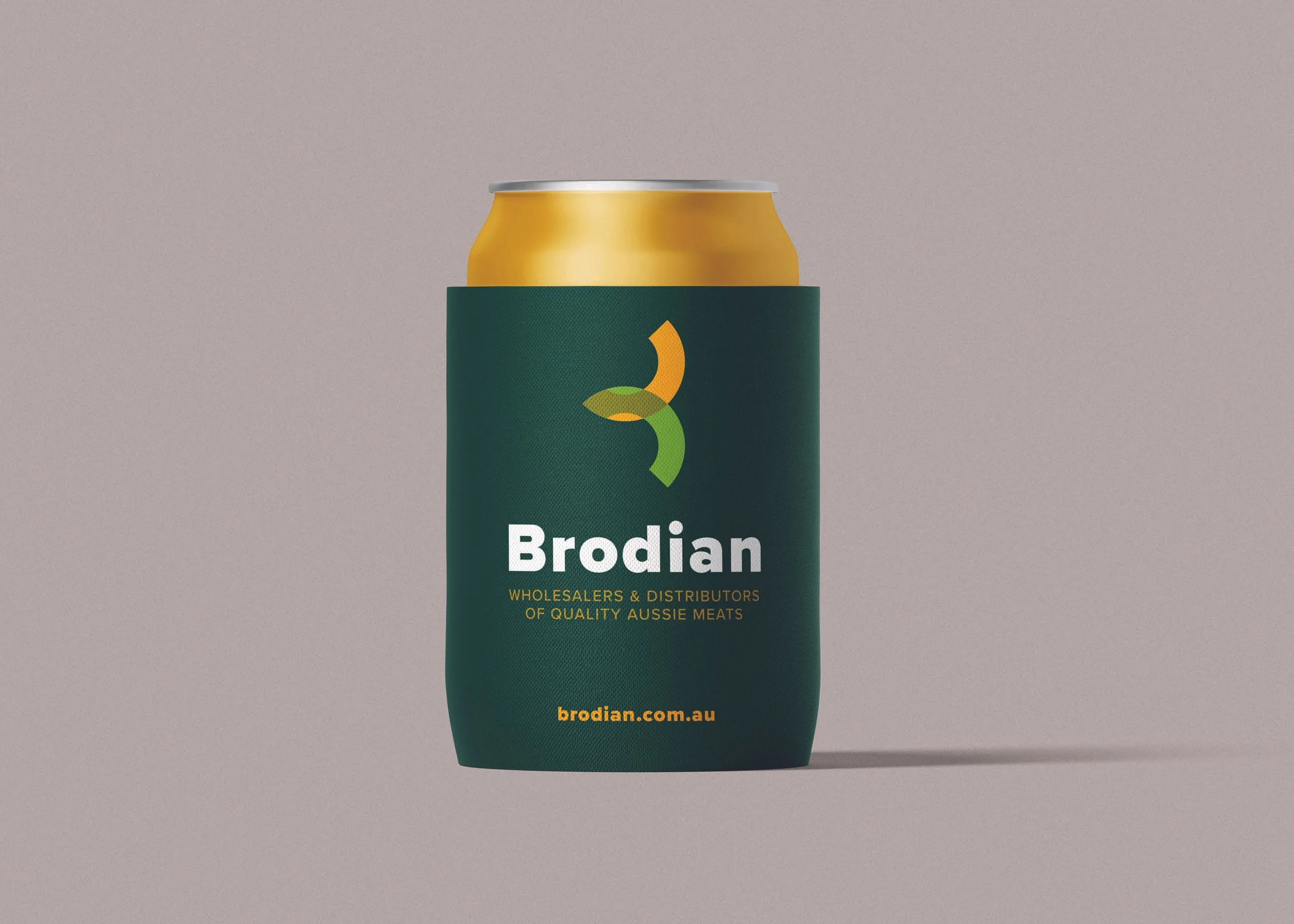
We developed a robust and memorable logo using the 2 arcs of the ‘Brodian B’ to cleverly signify Brodian's core wholesaling business - connecting the flows of unique meats from the country to the city.
The intersection of the 2 arcs, or flows, creates a directional arrow at the heart of the mark that hints at progress, movement and dynamism, in keeping with the aspirations of the Brodian business.
The colours palette grounds the brand mark in its earthy rural / country heritage, and hints at the very Australian nature of Brodian.
The transparency of the two arcs that is evident at the intersection point also suggests a kind of transparency, purity and trust - i.e. no smoke and mirrors, just "well planned, well organised flows", the hallmark of an experience working with Brodian.
To launch of Brodian, Dovetail have developed a range of brand tools to help support the brand including website, email campaigns, bespoke image library, promotional tools and all company templates.